

News about the Digital Humanities Innovation Lab
Introduction to Spatial Data in the Humanities
Published by Rebecca Dowson“If I had to draw a map of those four-plus years to illustrate the time between the day of my mother’s death and the day I began my hike on the Pacific Crest Trail...the map would be a confusion of lines in all directions, like a crackling Fourth of July sparkler with Minnesota at its inevitable center,” Cheryl Strayed writes in her autobiography, Wild. “But,” she continues, “those lines wouldn’t tell the story” (28). Indeed, those lines wouldn’t be able to tell the story of Cheryl’s grief the way she narrates it, but if we did map the places Cheryl travels to in the aftermath of her tragedy, what story would they tell?
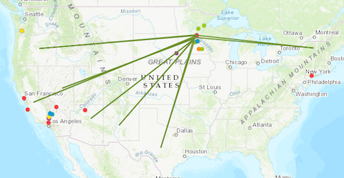
Mapping Cheryl Strayed’s “sparkler” travels from page 28 of Wild
That was the question Aateka Shashank and I tried to begin to answer during our two-part Introduction to Spatial Data in the Humanities workshop. The workshop was designed to introduce humanist researchers to two digital cartography tools that could help them visualize, make sense of, and tell a story with the spatial data in their research: ArcGIS and Story Maps. ArcGIS is mapping software that allows you to create maps with layers of data that you can pull from the ArcGIS database, from your own files, or create in the map itself. Story Maps is an online application that works with maps you have created in ArcGIS, along with text, images, and videos, to create a visual narrative. Many researchers in the humanities and social sciences have place-based data, whether they are studying objects, images, or texts from or about a particular place; narratives about a person’s movement or a place’s change over time; or information about networks of people or organizations, to name only a few examples. Aateka is an expert in using GIS, as the SFU Library Research Commons’ GIS peer and a graduate student in the Department of Geography. I have used Story Maps in my work with the DHIL, and have done plenty of textual analysis as a PhD candidate in the Department of English! We had both read and loved Cheryl Strayed’s Wild, so we decided to use the hiking memoir as an example of how to extract, clean, map, and narrate spatial data.
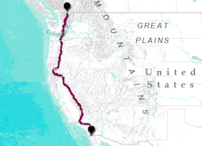
Map of the Pacific Crest Trail from the ArcGIS community
The first part of the workshop was dedicated to extracting and cleaning data from our text, and uploading it into ArcGIS. We talked about how we created a spreadsheet with both the basic categories necessary for ArcGIS to map our data, which are ID, latitude, and longitude; and the categories we wanted to use to analyze our data. This second category should likely include place names and locations, but could include anything a researcher wanted to analyze about the places in their text, which in our case was temporality (whether the place was from the present time of the memoir’s narrative or part of a flashback) and feeling (what the character and/or the reader was feeling at that place). We included a column in the spreadsheet to document the choices we were making (how we found the latitude and longitude for each place, for example), which is a crucial part of data management. We also created a column for adding notes as we went along with an eye to making our narrative later with Story Maps. We spent some hands-on time getting our data ready to upload into a new map in ArcGIS, making sure every GIS coordinate had its own row with an ID attached, and making sure our data was as consistent and concise as possible.
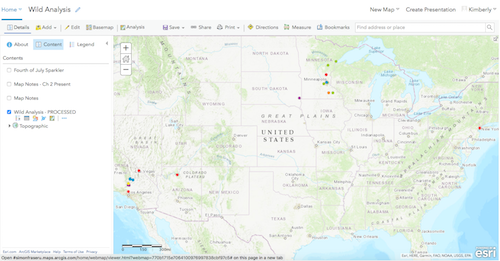
Wild Analysis data uploaded as a map layer in ArcGIS
Part two of our workshop was dedicated to turning our ArcGIS data into a Story Map. We uploaded our clean data into ArcGIS, which created a map by reading our metadata and data, plotting our latitude and longitude coordinates, and giving us some options for displaying our place markers. Then we launched Story Maps, using it to visualize the first chapters of Wild. We chose the Journal application, which visualizes the narrative with a large “main stage” map or image and an accompanying side panel that adds content via text and other images. We used our initial ArcGIS map as the main stage content, adding some functionality through Story Maps to zoom in on different areas and draw Cheryl’s “crackling Fourth of July sparkler” map as a layer in ArcGIS.
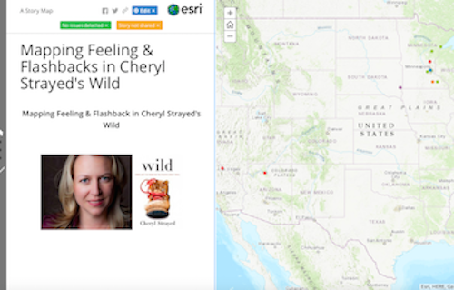
Cover page of our Story Map of Wild
You can find our workshop materials here. The slides and the data have been created by Aateka and I.
Both ArcGIS and Story Maps are user-friendly, but they also require a little bit of specialized knowledge to take full advantage of their features. There are instructional videos on Esri’s YouTube channel (like this Introduction to ArcGIS Online), and a helpful Resources page on the Story Maps site. You can contact Aateka or I for help at any stage. You can get in touch with Aateka via email: ashashan@sfu.ca, or find her on Twitter: @aatekas. You can get in touch with me via the lab’s email: dhil@sfu.ca, or my own: kkgilber@sfu.ca, or find me on Twitter: @kkodonnell.