

A current awareness resource for students & faculty members in Business & Economics
Now at SFU! Data Planet: one site, 500+ databases, 150+ billion data points
Published by Mark Bodnar
![]()
My initial post last fall about our trial access to Data Planet included many key details about the content and functionality. Rather than repeat all those big numbers, I'll use this post to link to some sample tables I created -- with the aim of whetting your appetite so that you'll dive in and start exploring!

- On campus: Click on the chart image, then scroll to the bottom of the datasheet to find a link that will take you to the same chart inside the live database.
- Off campus: I've included extra links below each image that will route you through our authentication processes before taking you to the same datasheets, complete with working links into the database.
New BC population numbers were published this weekend: our province had a net increase of over 70,000 people. Of course, nested inside that +70K are a mix of ups and downs -- emigration, immigration, deaths, births, etc. I decided to use Data Planet to dig deeper into the numbers for the Greater Vancouver area, which apparently grew by over 39K in the last year:
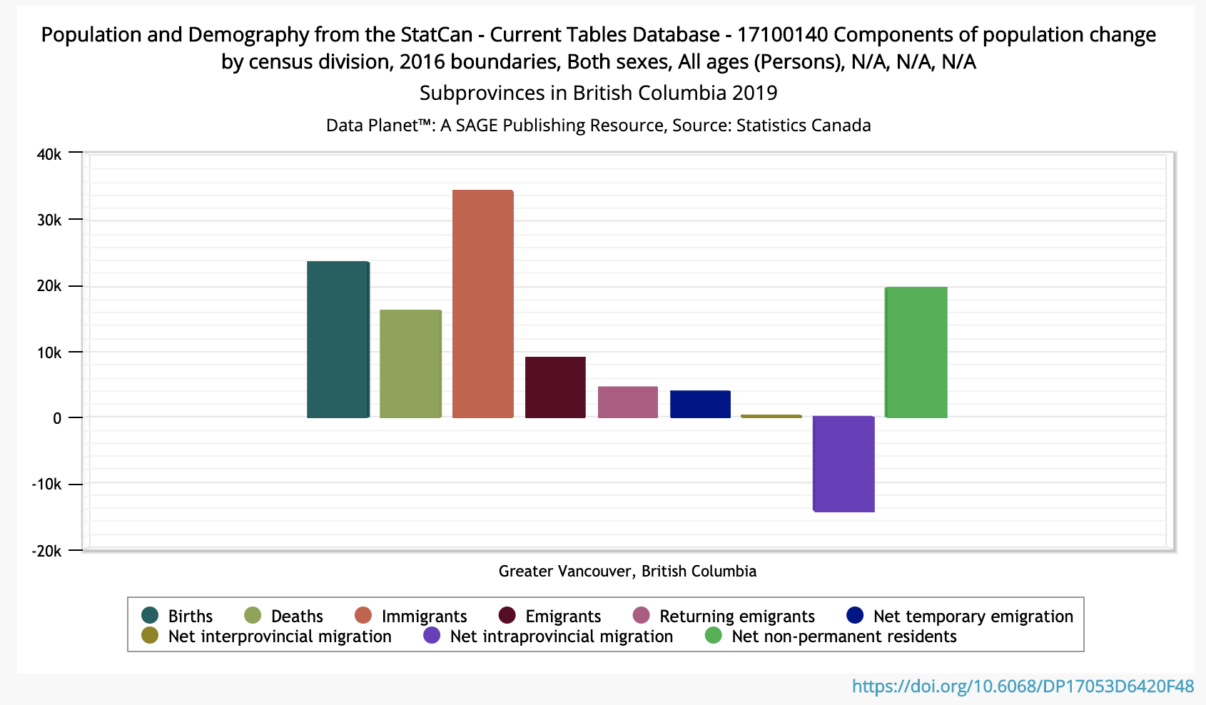
[Click on the chart image for a full datasheet. SFU folks: click here instead.]
It's interesting (to me, at least!) that the sole negative component in our local growth is "intraprovincial migration." That is, over 14K people left the Metro area for other parts of BC. While that could be for jobs, love, or a desire to avoid the rain, my mind immediately turns to housing supply and costs...
Curious what percentage of all residential housing construction in the region was made up of rental units, as compared to condo units and units built for specific homeowners, I next used Data Planet to chart the number and type of housing starts in Greater Vancouver.
The resulting chart looks a bit noisy, but there are some interesting developments hidden in those squiggles (SFU link). We can see it better if we zoom in on the last decade (see below): the red and pink lines have crossed! Or, in less graphic terms, the percentage of total housing units being built in Greater Vancouver for rental units is now greater than the percentage being built for homeowners. (Condos are still king, though.)
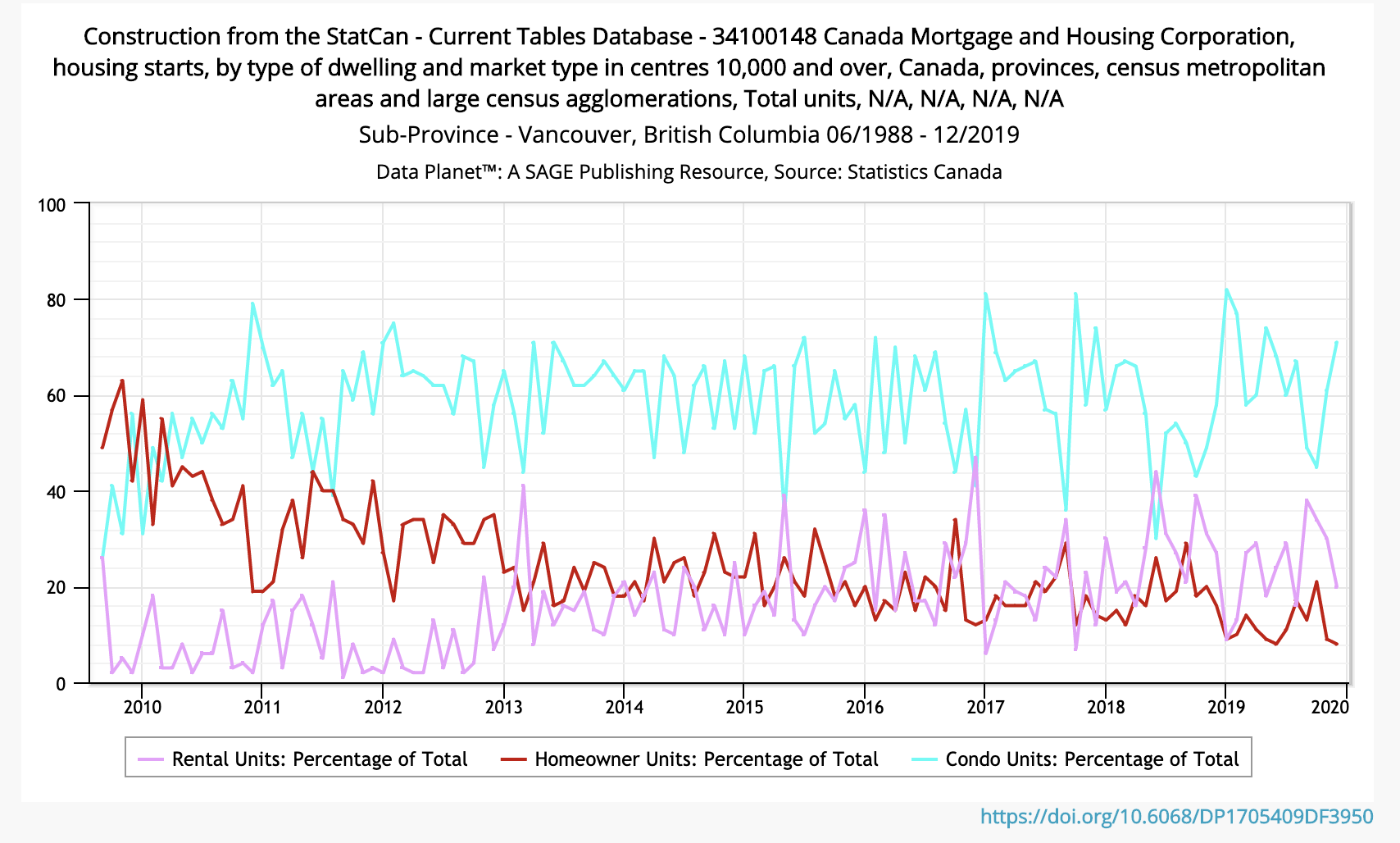
[Click on the chart image for a full datasheet. SFU folks: click here instead.]
Peeking behind the curtain a bit, that last chart involved selecting multiple time series, adding some calculated columns to the existing data, hiding unneeded intermediate columns, and zooming in on a specific time range, just a few of the many functions offered by Data Planet.
Back up at the national level, let's take a quick look at one of our newest (legal) industries: cannabis. Check out this chart showing the contribution to Canada's GDP from licensed and unlicensed cannabis production:
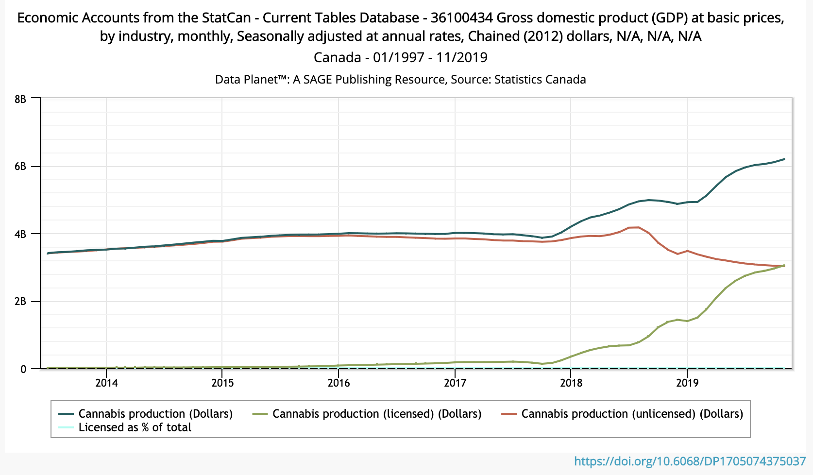
[Click on the chart image for a full datasheet. SFU folks: click here instead.]
As you may know, Statistics Canada has been collecting data on both the legal and illegal aspects of the industry, including medical and recreational uses, but browsing through raw data is an inefficient way to find potential relationships. That's where a graphic representation helps highlight interesting research questions: Has overall production/consumption really gone up, or was the unlicensed production inaccurately measured in the past? If most of the boom in overall production is largely due to licensed production, has the number of consumers increased (many first-timers) or have the existing consumers increased consumption, or...?
Data Planet covers far more than our little corner of the globe, of course! In fact, the majority of its data sources are from far beyond our borders. Here are just a few of the acronyms on the list: WTO, OECD, UN, IMF, BEA, EIA, EC... all in one database where they can be mixed and matched as needed.
Digging into one of those international sources -- the World Bank's World Development Indicators -- I spotted time series on various methods of international electricity production. Given the many news articles I've read about a boom in renewable energy production, I expected to see a line chart with lots of crossing lines: fossil fuel use decreasing, while alternatives ramped up...
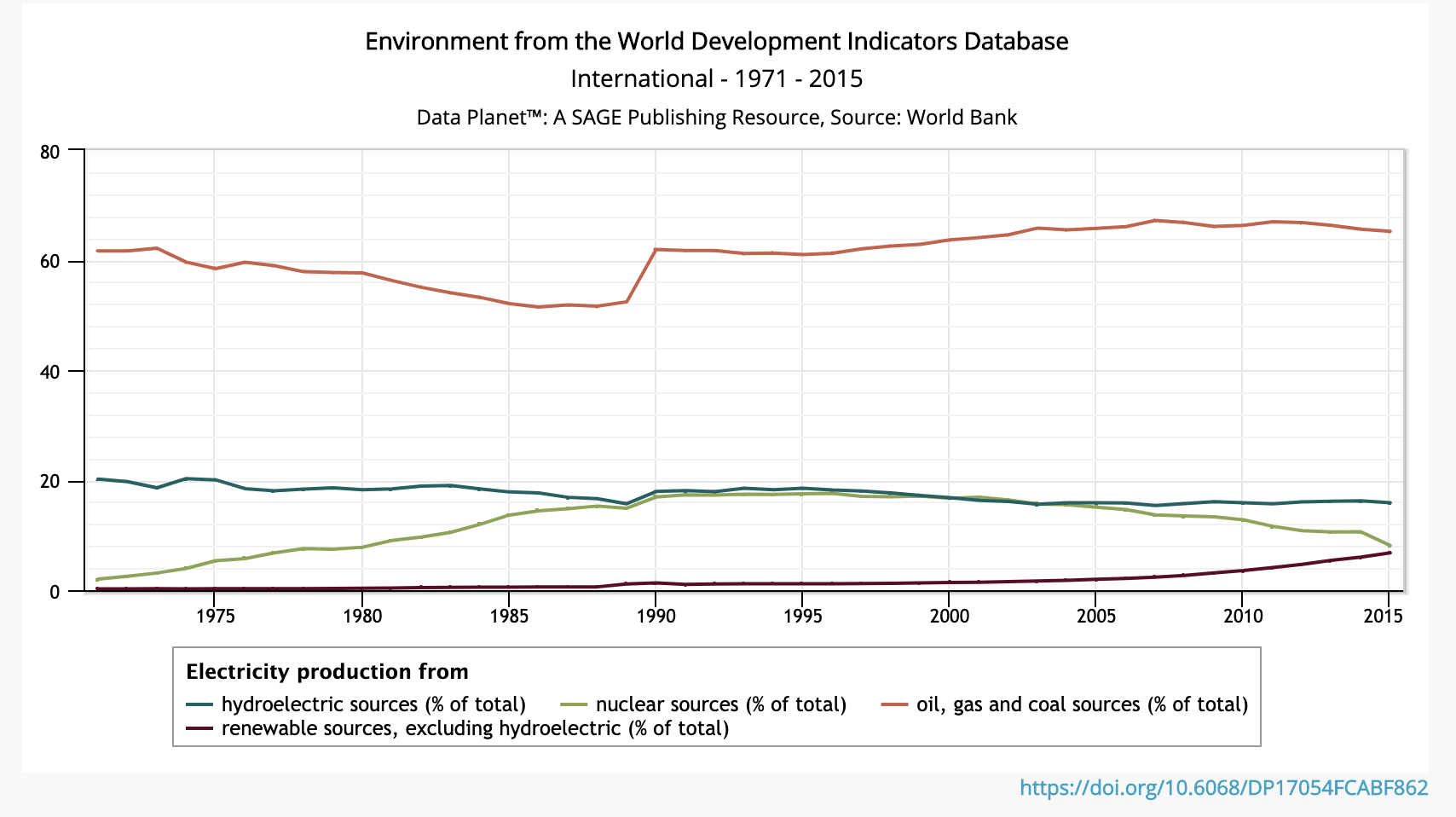
[Click on the chart image for a full datasheet. SFU folks: click here instead.]
Sadly, although the use of renewables in electricity production is up -- that's the red line down at the bottom that is optimistically angling slightly upwards -- the share of electricity produced that way is still only around 10% of the amount produced using oil, gas, and coal... which has remained above 60% of the total for more than a quarter century. This version of the chart is zoomed in on the 2010-2015 years, in case you'd like to see a close-up view of the depressingly flat fossil fuel lines (SFU link)... <sigh>.
If you're like me and need some positive news after that flat chart, check out this chart of electricity production capacity in Germany (SFU link). They started moving toward renewables much earlier than many countries, and for the last few decades the fossil fuels line has been flat/declining, while the renewables and total lines have curved upward.
Finally, since our neighbours to the south are in a presidential election year, I thought it might be useful to look at their unemployment and prime rates for the last 70 years, with overlays showing recessions and the presence of either a Democrat or a Republican in the White House. I'll leave it to you to explore in more depth and try to separate causation from correlation in the resulting colourful chart:
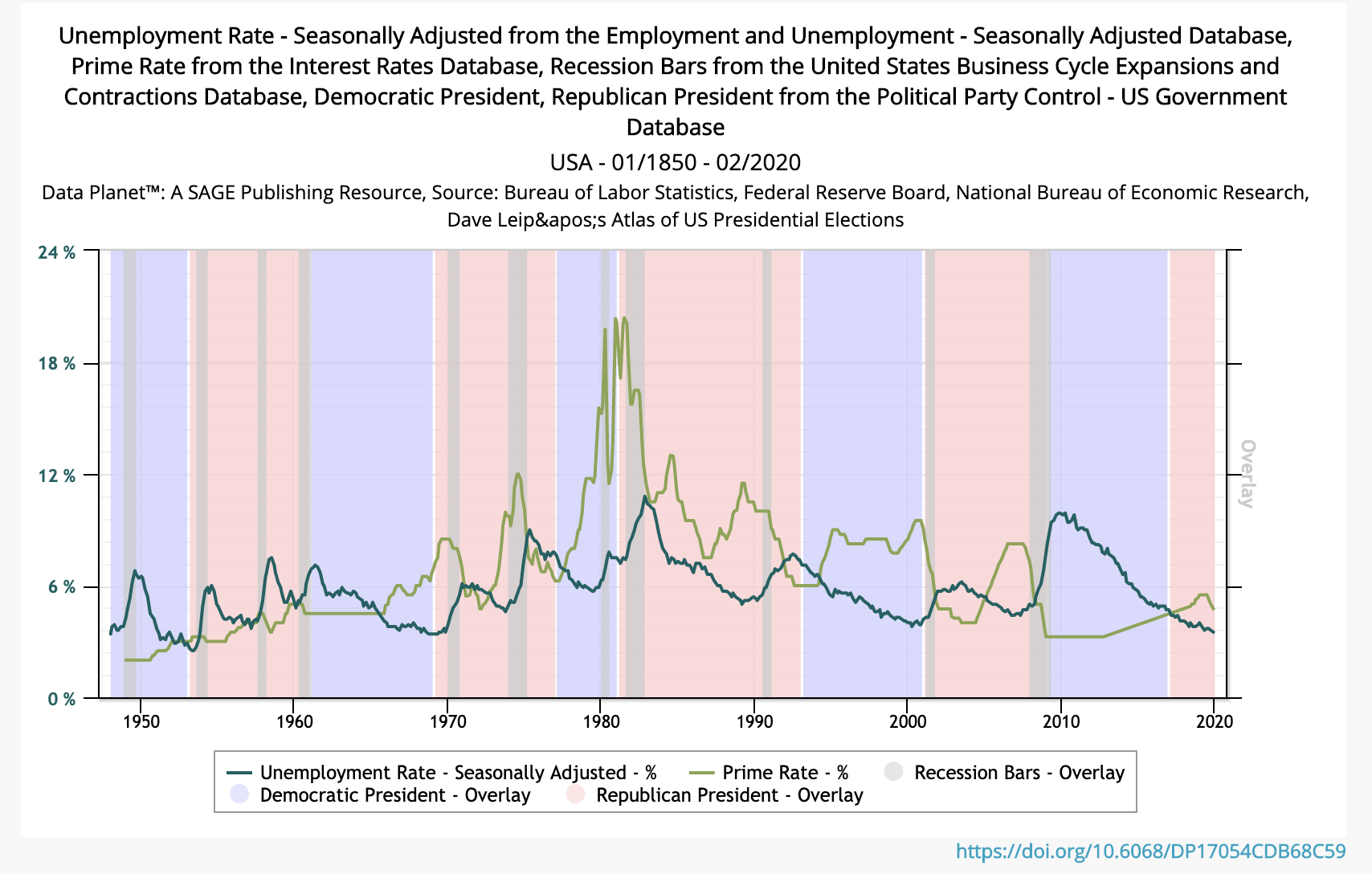
[Click on the chart image for a full datasheet. SFU folks: click here instead.]
I hope this gives you a taste of what's possible with this database. I plan to highlight specific content and features in additional posts later this semester. Be sure to search for the tag -- Data Planet -- to find such posts.

-- Mark
--------------
Mark Bodnar
Economics & Business Librarian
mbodnar@sfu.ca