

A current awareness resource for students & faculty members in Business & Economics
Visualizing natural gas data via Data Planet
Published by Mark BodnarAt the broadest possible level, my initial Data Planet search came up with over 220,000 time series that touched on natural gas in Canada. (Change the default "Group by similar results" option to "Show all results" to see the full range of results.)
The majority of those series were from Statistics Canada (including data from the same three tables that were highlighted in The Daily: storage, transmission, and distribution), along with few related series from sources such as the US EIA, OECD, and the World Bank.
StatsCan offers single webpages for each of those three topics. Researchers can then adjust the time period, geographic scope, units, etc. to create a table that fits their needs. This is a smooth and simple process, and the resulting tables are clear and easy to work with. Moreover, the newest data is readily available -- a clear advantage over Data Planet which will often be slightly out of sync with the original publishers of data sources.
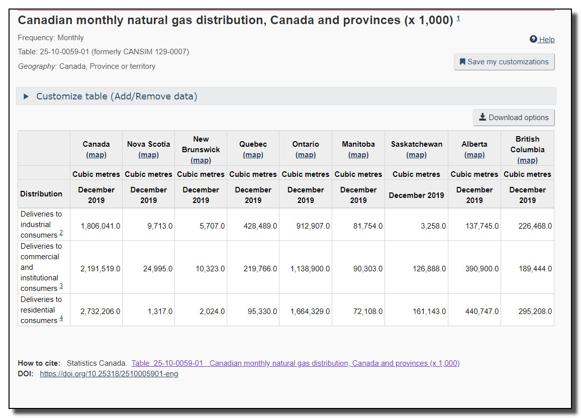
Here's an abbreviated example of the sort of table I can generate via the Statistics Canada site. Click to enlarge it, or go here to create your own table with the same data.

Data Planet, in comparison, provides 148 different entries for the same three topics/tables, each with a slightly different combination of variables and units, and with varying output options. For example, I can get a map of Canada with the provinces coloured to illustrate the relative amount of natural gas each province has exported to the USA:
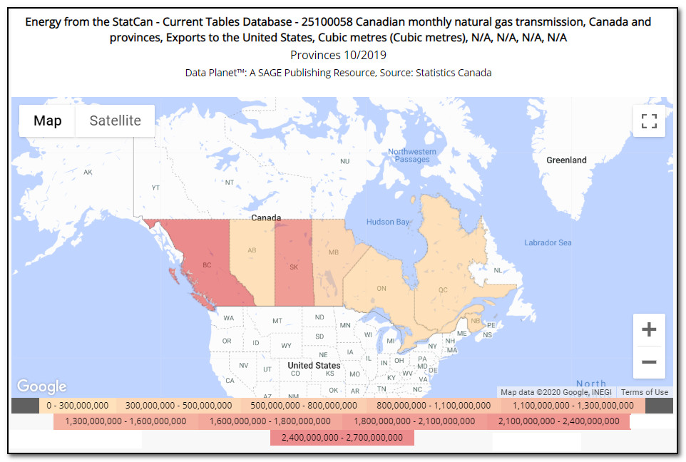
[Off-campus SFU researchers: click here]
Another example: here's a bar chart showing the closing inventories of natural gas in October by province for the last 3 years:
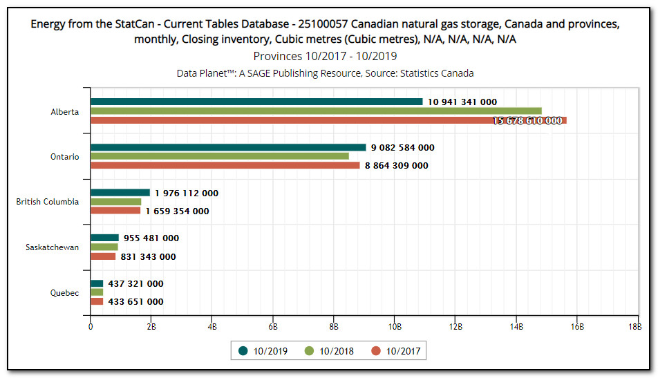
[Off-campus SFU researchers: click here]
In some cases, a pie chart can give you a clearer sense of the relative scale of the data being visualized. Check out this pie chart showing the distribution/delivery of natural gas by province to residential customers:
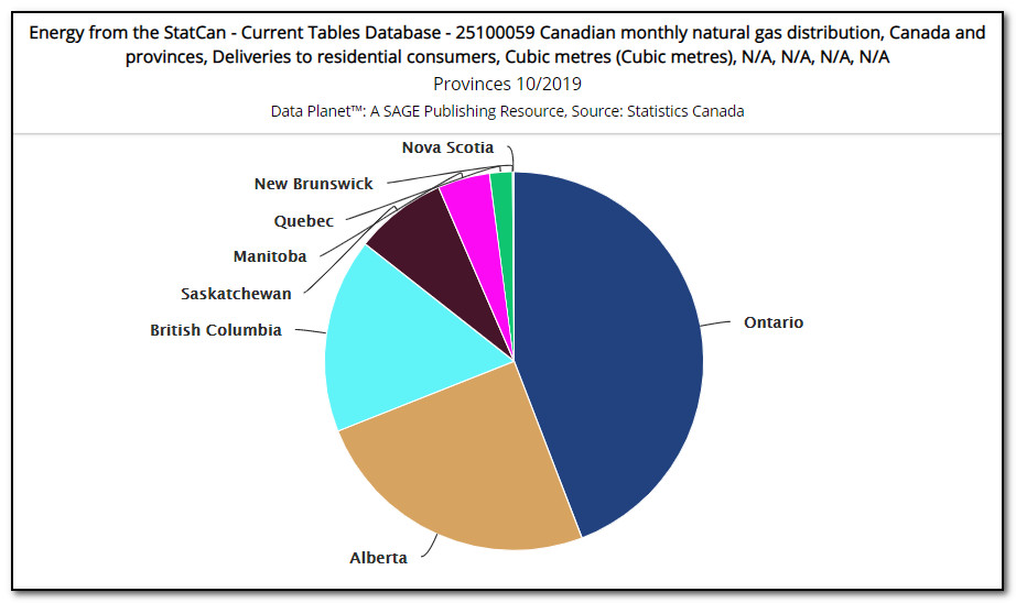
[Off-campus SFU researchers: click here]
Data Planet can also create more complex pie charts that illustrate multiple series at once. Here, for instance, is a detailed pie chart showing the distribution of natural gas to residential, industrial, and commercial/institutional customers, by province. (SFU off-campus link)
In my last post about Data Planet, I included several examples of the trend/line charts that can be produced in the database, but I'll include one in this post as well to round out the visualization options. Here's a chart showing the trend in production of various types of fossil fuel-based primary energy resources in Canada. Note that the units aren't the same for each resource, so your focus should be on the change over time, rather than the relative levels of production of each resource in a given year.
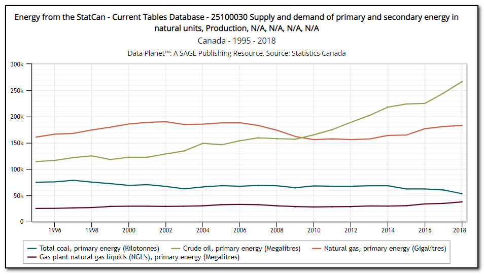
[Off-campus SFU researchers: click here]
Those are the four main charting options in Data Planet: maps, bar charts (ranks), pie charts, and trends (lines), each of which can help you be more effective and efficient at discovering trends & surprises than is possible with a simple table of numbers.
Researchers can also export the underlying tabular data to be charted and analyzed in external software, of course, but this ability to both find data and visualize it in multiple ways within a single interface is one of the main benefits of our new Data Planet database. Give it a try!
To learn more about charting in Data Planet, check out these Data Planet guides: Mapping and Manipulating the Data.
-- Mark
--------------
Mark Bodnar
Economics & Business Librarian
mbodnar@sfu.ca