

The latest news and answers to your questions about scholarly publishing and open access.
Maps as a powerful tool for communication: Recapping GIS Day 2019
Published by Sarah (Tong) ZhangCelebrating GIS Day 2019
The SFU Library hosted an event to celebrate GIS Day on November 13, 2019, at SFU Harbour Center. As the GIS librarian, I was keenly interested in what had drawn people into this event. The Intro to Spatial Data with R workshop was very well attended, with participants from across disciplines, from biology, economy, health, to of course geography, demonstrating the increasing appeal of R as well as GIS. There was a great vibe - the participants were engaged, asking a lot of questions and jumping in to help each other out. People were awed at the potential of using a R package for processing raster data and visualize, without spending a lot of time learning the syntax, an open dataset downloaded from the City of Vancouver’s open data portal. That liberating sense must have felt good: it's great to know you don’t have to be shackled to an expensive proprietary GIS software, at least for certain tasks.
A map can be a powerful tool for communication
I was also struck by the enthusiasm with which the participants shared their first-hand experience of how powerful a map could be as a communication tool. This observation can be easily illustrated by the talk given by Kate Hosford, a doctoral candidate in Health Sciences during the Student Map Competition Presentation session. Her map was entitled “Bikeway Network Expansion and Bicycle Commute to Work Mode Share by Census Tract, Vancouver, BC, 1996-2016”, which aimed to answer the question that whether residential access to bikeways influence commuting to work by bicycle. Most interestingly, she didn’t confine herself to publishing the findings with an academic journal, but instead took to social media, tweeting out the map. To her amazement, she received overwhelmingly positive feedback: 2500 engagements, 110 retweets, and 300 likes! The map she made, as an end-product of a process of spatial/non-spatial data collection, cleaning, analysis, and visualization, proved to be a remarkable tool to get people thinking and discussing. By doing so, she managed to draw a much larger circle of influence for her study: “this map, which I made on one Friday afternoon, generated more conversation and reached more people outside of academia than any other manuscript that I published”, Kate thoughtfully pointed out.
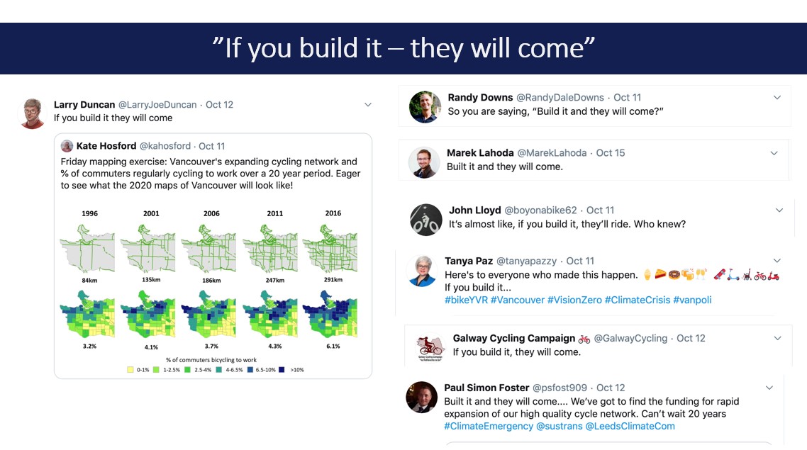
Kate’s tweet about her map and the discussions on Twitter
You might be wondering, though, whether posting only a visualization on social media would be misleading... After all, it is visually attractive but it is meant to be a part of a larger scholarly conversation. Kate has given some thoughts to this concern: “I don’t think it downplays the importance of research but it did inspire me to strive to include a visual with every paper I publish that can help communicate either my research question or findings to the public.”
Congratulations to the winner of our Student Map Competition!
If you are still not convinced that maps can be a beautiful, effective tool for communication, look no further than the winner of our Student Map Competition, “Mapping the World’s Sharks, Rays, and Chimaeras”, made by Danielle H. Derrick from Biology. Don’t you think this visually appealing map is a great way to raise awareness around the fact that two thirds of all Chondrichthyans (sharks, rays, chimaeras) are experiencing some degree of threat?
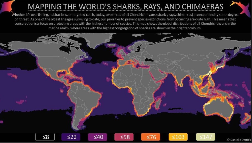
Mapping the World’s Sharks, Rays, and Chimaeras, by Danielle H. Derrick
Interactive maps: more than just a static image
Today, maps are no longer just a static image on a page. Over the last decade, development in GIS technologies has made it possible to move maps to the web, so that it's possible to interact with a map, as well as the data behind it, right through your browser. We invited a team of SFU students Alysha van Duynhoven and Chris Yee, who won the 2018 Esri App Challenge, to talk about their experience with developing a web map app. Their app goElectric (click and take a look!) enables users to support users in exploring and comparing electric vehicles (EVs) for their daily commute in Vancouver and beyond the city extent. You can easily compare against fuel-powered vehicles in annual fuel and electricity costs, to view charging stations located within the city, and to calculate EV driving ranges. This is brilliant- what better means is there to bring together all the information and data- streets, annual EV costs to charge, number of your round-trips per week, charging stations and so on- in such an engaging way?
We're excited about GIS every day
If this summary has you feeling pumped about GIS (or maybe you made a new year’s resolution to learn more?) you should know the library is here to help; we offer a variety of GIS-related workshops, plus consultations and open office hours. We'd love to hear from you! Send us an email at data-services@sfu.ca. You can also check our website to stay up to date on all things GIS!
Contact us: For assistance with scholarly publishing, please contact digital-scholarship@sfu.ca.

This work, the Simon Fraser University Scholarly Publishing website, is licensed under a Creative Commons Attribution-NonCommercial 4.0 International License unless otherwise noted.