
The latest news and answers to your questions about scholarly publishing and open access.
Leveraging Web Mapping Technologies to Communicate Your Research: Introducing our new Web GIS Workshop Series
This blog post was contributed by Sarah Zhang, GIS/Map Librarian at SFU Library.
What has the Open Scholarship and Knowledge Mobilization movements taught us?
The Open Scholarship and Knowledge Mobilization movements encourage us to think hard about how digital media and the open web have revolutionarily disrupted the traditional way of publishing. The ways to disseminate and communicate research has never been more diverse and accessible, targeting a broad audience of specialists and non-specialists. Just think about the novel avenues in which researchers have dabbled to put their intellectual output: blogs, podcasts (or newly invented open peer-reviewed podcasts), and numerous web-based projects.
Neo-geography: breaking out of the box of professional GIS
Coinciding with the sweeping open scholarship movement is the proliferation of web maps, known as neo-geography. In the past decade, revolutionary internet technologies have driven Geographic Information System (GIS) to expand far beyond the professional GIS community. Many individuals who lack traditional GIS training- engineers, entrepreneurs, journalists, researchers- have been involved in web cartography work. The empowerment, to my amazement, is fueled by geospatially enabled technologies such as Global Positional Systems (GPS), the Internet, and user-friendly cartography tools.
Web maps: what and why
Is there an intersection of the above two exciting trends? I believe so, and one way to think of it is for researchers to leverage web mapping technologies to communicate their research, in a web-enabled and engaging way.
Web maps are central to understanding this ecosystem. So let’s take a moment to define what a web map is. A web map is an interactive display of geographic information that can be opened in browsers or mobile apps. You likely encounter web maps in your everyday life: Google Maps, Craigslist, Yelp, real estate websites all have web map elements embedded.
But why web maps? Well, let’s consider this map: An Extremely Detailed map of the 2016 Election by the New York Times. If you follow the US election news, you’ve likely seen an election map at the county level- blue counties and red counties. What the New York Times did differently, however, is drilling down to the precinct level (which may contain only thousands of voters). Therefore providing a much finer scale of analysis. You can click on each precinct and find out the percentage of people who voted for Hillary Clinton and Donald Trump in that area, and compare it to other areas. There are tons of thousands of precincts! Can you imagine squeezing this massive amount of information into one single static map? This is where the features of web maps, dynamic scale/contents and interactivity, come into action- what you see changes as you zoom in and out.
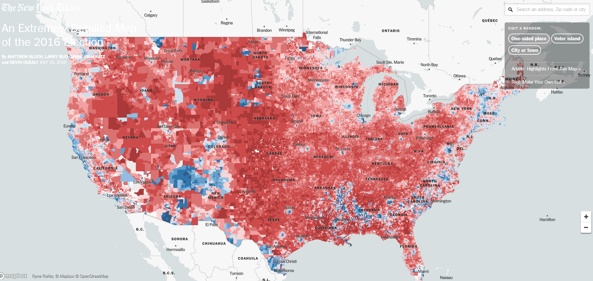 Screenshot: An Extremely Detailed map of the 2016 Election by the New York Times
Leverage web mapping technologies to communicate your research
Many research stories could be better shared using web mapping technology. For example, ArcGIS StoryMaps, an online storytelling tool enables you to integrate interactive maps from ArcGIS with multimedia content and create an immersive storytelling experience. For example, Restoring Old Havana, as you scroll down the page, a story slowly unfolds- with stunning pictures- about where Havana is, its place as an architectural diamond, how the architectural treasure fell victim to decay and collapse following the 1959 revolution and the collapse of the Soviet Union.
Now pay attention to the introduction of a restoration project and the maps below. What do you notice about this map? (For people who prefer to not follow the above, I provide two screenshots below, but for the full immersive experience I recommend clicking on the link it).
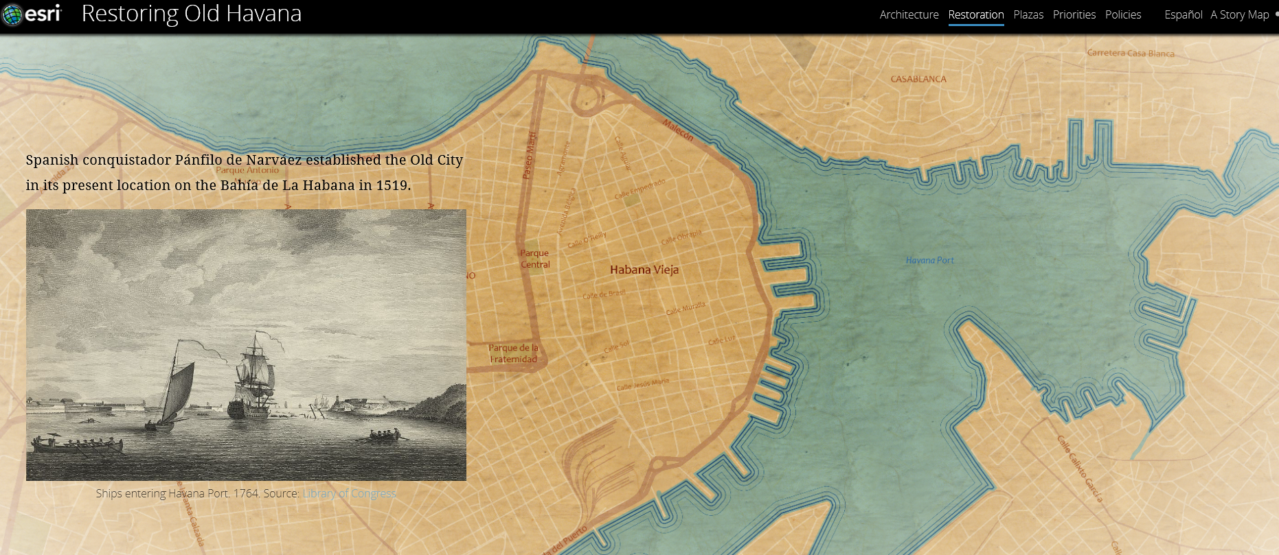
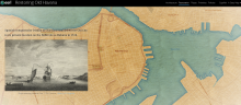
Screenshot 1 from Restoring Old Havana (the origin of Havana Old City)
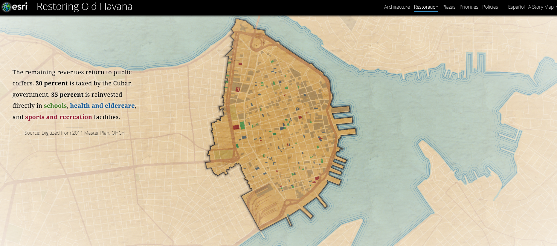 Screenshot 2 from Restoring Old Havana. (The distribution of various facilities that benefited from the restoration project. Notice the map has no legends, but instead has color-coded text for each category in the narration.)
You are right, the map changes as you scroll! It starts from the origin of the old city, then switches to the scope of the preservation activities, then to where the restored buildings are located, followed by the schools, health and eldercare, sports, and recreation facilities that were helped by the project.
Noticeably, alongside the map, the narratives on the left change as the maps switch, and the legends are color-coded in the narrative! Do you feel like someone is just standing by the map and telling you the story personally rather than leaving you to struggle to figure out layers of meanings on your own? That is exactly the beauty of StoryMaps: you can tell a story entangled with maps progressively.
Maps have always been great tools for enhancing how you communicate your research to diverse audiences, but web mapping technologies have only augmented this ability, in an unconventionally engaging way if you know how to use them to your advantage.
Interested in trying web mapping yourself?
We are excited about the potential of neo-geography and web mapping for communicating SFU research and want to share our expertise with you! Thus, we are launching a new Web GIS Workshop Series. The series will give you a taste of the web mapping ecosystem, introduce you to a range of concepts, tools, and skills including how a web map is structured, how to create a web map(in both a code-free way and computational way), how to collaboratively collect field data and populate a shared web map, and more.
Be sure to register for this exciting new workshop series!
Special thanks to Lupin Battersby, the SFU Knowledge Mobilization Officer, for editing this post and suggesting ideas.
Contact us: For assistance with scholarly publishing, please contact digital-scholarship@sfu.ca.

This work, the Simon Fraser University Scholarly Publishing website, is licensed under a Creative Commons Attribution-NonCommercial 4.0 International License unless otherwise noted.