On this page
GIS/mapping is an invaluable approach for community-based research, participatory projects, and equity/diversity-related issues.
We hope these mapping project examples will inspire scholars, students, and community researchers to try some of these tools and techniques. These usage examples, at the core, all try to expand the reach of GIS, with many being created by "non GIS experts", for a larger audience, and tapping into new web-based technologies.
Example: Mapping COVID-19 risks in British Columbia's neighbourhoods
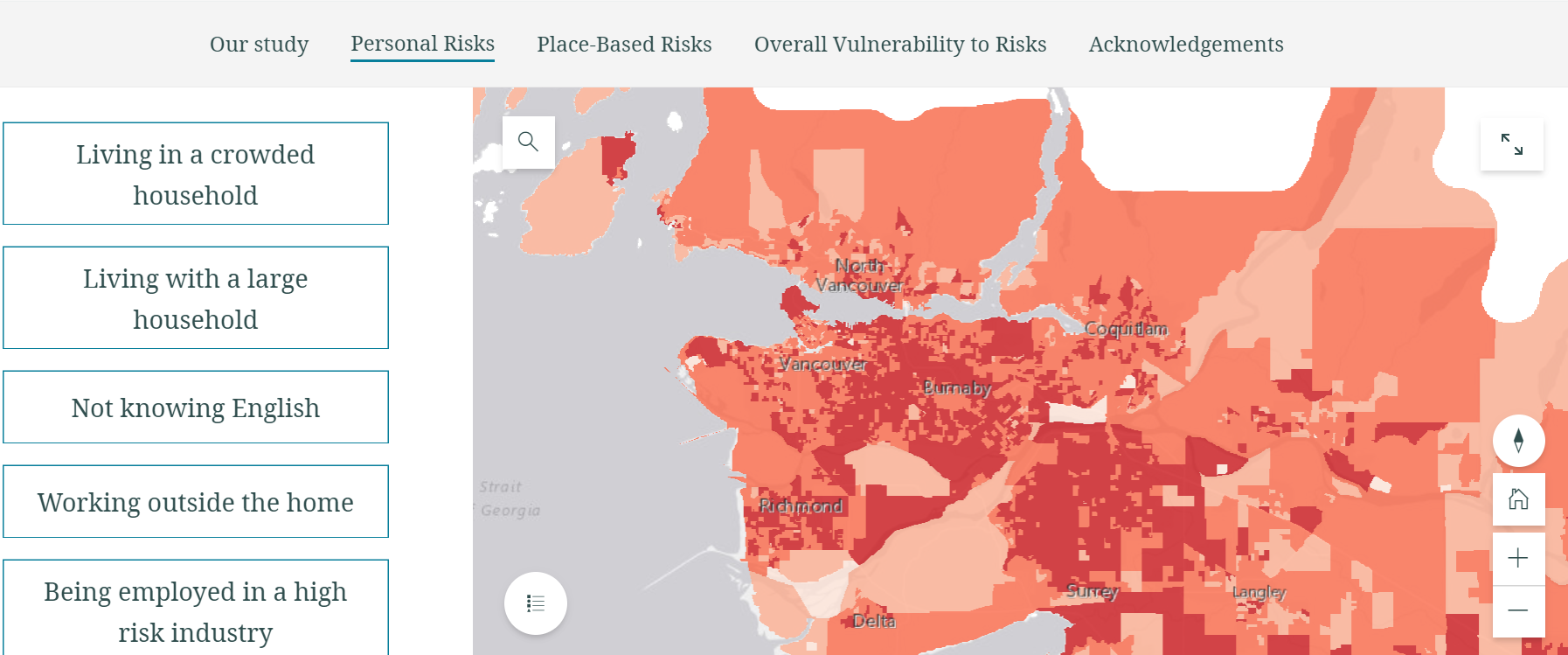
To start, here is a good example of using an interactive map showing relative risk of developing COVID-19 based on key characteristics of the people who live in a neighborhood. Source: Covid-19 Risks in British Columbia’s Neighbourhoods: Mapping Risks & Vulnerability Across the Province (more details below in the Why use GIS for community-based research? section)
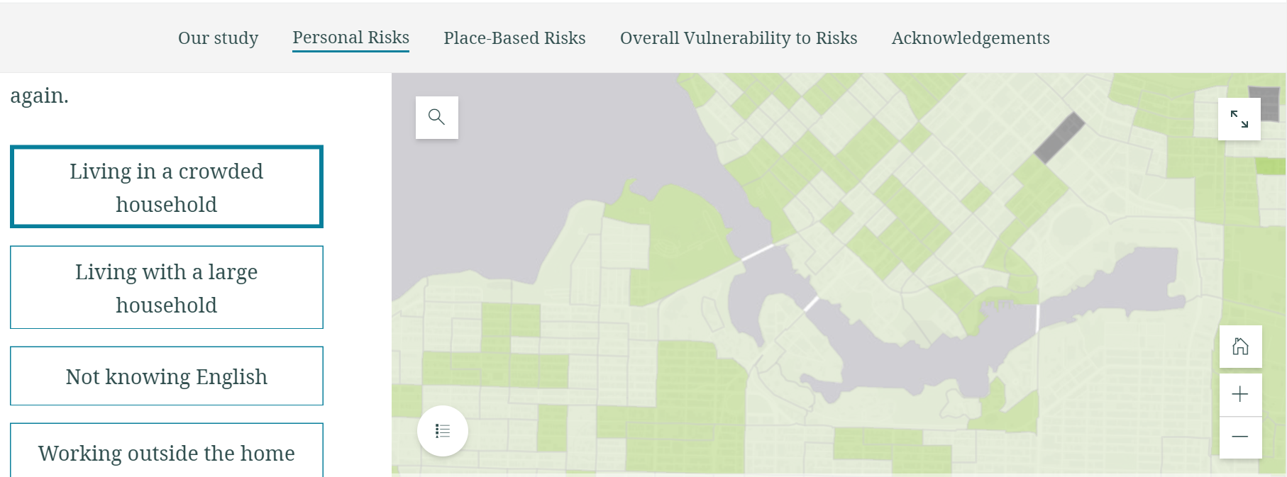
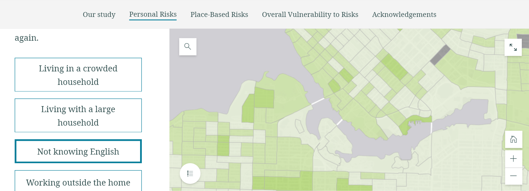
The interactive map allows viewers to look at one attribute at a time that factors in the vulnerability model.
This image shows the spatial distribution for the overall personal risks:

This image shows the personal risks with only the factor of living in a crowded household:

This image shows the personal risks with only the factor of Not Knowing English:

Why use GIS for community-based research?
GIS is a powerful tool that can be used for analysis and assessment of the community or of an issue, and the planning, implementation, and evaluation of intervention or initiative. Some of the advantages of using GIS:
- It can help you determine how seriously an issue affects an area or the community as a whole.
- It can demonstrate how differently an issue affects different populations or geographical areas.
- It can provide a picture of the community’s or area’s assets and weaknesses.
- It can help in designing, implementing, and evaluating interventions.
- It can make your research more accessible to your community.
- Perhaps most important, GIS/maps can help influence policy.
For more, see Community Tool Box Section 16. Geographic Information Systems: Tools for Community Mapping
Examples
Covid-19 Risks in British Columbia’s Neighbourhoods: Mapping Risks & Vulnerability Across the Province [Interactive map]
A project by SFU researchers, Dr. Valorie Crooks (Principal Investigator) and Dr. Nadine Schuurman (Co-Investigator) and other team members. A number of reasons factor in why some British Columbians are more likely to develop COVID-19 than others. The interactive map showing the COVID-19 risks and vulnerability, developed by the project team, intends to provide new insights into how to manage the COVID-19 pandemic in BC and where policy and public and public health efforts should be focused.
Mapping platform: ArcGIS Storymaps
Mapping the Covid-19 pandemic's secondary health impacts [Interactive map]
A project by SFU researchers, Dr. Valorie Crooks (Principal Investigator) and Dr. Nadine Schuurman (Co-Investigator) and other team members. Mapping at the Dissemination Area (neighborhood) level, the map looks at five factors contributing to secondary health impacts including housing insecurity, job insecurity, occupational burnout, loneliness/isolation, and educational disruption. The map can help to better understand where policy and public health efforts should be focused in the later stages of the COVID-19.
Mapping platform: ArcGIS Storymaps
Room to Move: Approaches to Covid-19 street reallocations in four Canadian cities [interactive map]
A project by SFU researchers, Jaimy Fischer, Meghan Winters, Caislin Firth and Karen Labaree at CHATR lab. Examining COVID-19 street reallocations in four Canadian cities, the project aims to understand what kinds of street reallocations these cities made, and what kinds of neighbourhoods had access to them. The site includes interactive maps showing COVID-19 street reallocation in the cities overlaid with different measure for population density, active living enviroment, mobility, and access to essential destinations at the neighourhood level.
Mapping platform: ArcGIS Storymaps
Census 2020 Hard to Count (HTC) Map [Interactive map]
Developed by the Mapping Black California (MBC) Census Lab, the map seeks to better understand the state of California’s Black hard-to-count (HTC) population. Their goal is to visualize data to address the social, political, and economic issues that affect this marginalized group and use this data to create change-“Trusted Messages from Trusted Messengers on Trusted Channels” provides insight, education, and inspires action in the Black community".
Mapping platform: ArcGIS Online Web App Builder
What is participatory mapping?
Some technological revolutions in the past two decades have given rise to a proliferation of web-based geospatial applications, for example, Google Maps, Bing Maps, Open Street Map, and numerous social media sites with geotagging functions. These user-friendly cartography tools, along with Global Positioning System (GPS), have allowed for people without formal GIS training to be involved in mapping activities.
Generally defined, participatory mapping is the creation of maps by members of the public. It’s often linked to the term Volunteered Geographic Information (VGI).
One type of use of participatory mapping is to take on an advocacy role and actively seek recognition for community spaces through identifying land uses, local experiences and environmental considerations. In this sense, participatory mapping often involves supporting organizations including governments (at various levels), non-governmental organizations (NGOs), universities, developers and other actors engaged in land-related issues.
Participatory mapping can also be implemented in the context of Citizen Science, which can be defined as scientific activities in which non-professional scientists voluntarily participate in data collection, analysis and dissemination of a scientific project.
Examples
The Canadian Bikeway Comfort and Safety (Can-BICS) OSM
Researchers at SFU CHATR Lab (Cities, Health & Active Transportation Research Lab) developed Can-BICS, a national bicycling infrastructure dataset. The Can-BICS classification was applied to the data from OpenStreetMap, a volunteered map of the world, to create an up-to-date and extensive map of bicycle facilities across Canada. The research team organized a mapathon to collect community feedback on the Can-BICS map.
Mapping platform: OpenStreetMap(OSM)
Youth.Hood
Researchers from the SFU CHATR lab worked with youth (15-19 years) living in South Vancouver to map things in the environment that promote or prevent social connectedness using a smartphone app.
BikeMaps.org [Interactive map]
A crowd-sourcing project that collects people's cycling experience with the goal of making biking safer. The site enables the general public to map their experience of cycling safety, hazards, and bike thefts. Data is analyzed using GIS and statistics to identify hot spots of cycling saftey, risk, and crime. SFU researchers Dr. Meghan Winters and Jaimy Fischer are involved.
Mapping platform: Leaflet
Hate Crime Map [Interactive map]
A project funded by the UCLA American Indian Studies Center under the Institute of American Cultures. The map interactively shows the number and types of hate crimes that have occurred in each state in the U.S. as well as COVID-related hate crimes. The website represents a crowd-sourcing approach that enables victims to report hate-based incidents in detail. Read more about the creation of this map here: Interactive map will crowdsource hate crime reports.
Mapping platform: Leaflet
Mapping the Black Lives Matters Movement [Interactive map]
This map shows the hundreds of protests demanding justice for George Floyd that occurred across the United States in 2020 and highlights key images from each city. It features a crowd-sourcing function that allows people to add data about protests. Read this blog post that explains the app.
Mapping platform: Mapbox
What is Asset Mapping?
Asset Mapping can be understood as a subset of Participatory Mapping. It is a process where community members collectively create asset maps by identifying and providing the information about their own community's assets on a map. It supports strategic planning effort to address community issues by building on resources and strengths2. The process may include research questions creation, data collection by hosting community mapping events, community-engaged data analysis, and advocacy and policy recommendations. The process itself is as important as the end product of a community asset map to engagement and empowerment.
Examples
Citizen Science Food Asset Map by SFU Food Systems Lab [Interactive map]
The Food Systems Lab team engaged with community members to explore what Vancouverites see as food assets in their city and what food assets mean to them. The interactive map therefore represents the "assets" that reflect the lived experiences of communities.
Mapping platform: Mapme
Vancouver's Share Map [Interactive map]
Vancouver's Share map was developed aiming to connect Vancouver to the growing sharing economy movement for sharing organizations, residents, community groups, and partner organizations interested in sharing initiatives. A MapJam event was hosted, resulting in the map. Please be aware that the map is not updated.
Mapping platform: Google My Maps
Vancouver Food Asset Map [Interactive map]
The project was developed collaboratively by Vancouver Coastal Health, Vancouver Neighborhood Food Networks, UBC, Fresh Roots and the City of Vancouver. The map aims to provide a tool to community members and partners for locating community food assets that is current, easy to use and easily updated; to build community capacity to support community members dealing with food insecurity; and to make it easier for community partners to view and use community food assets strategically.
Mapping platform: Google My Maps
Mapping for equity/diversity/social justice (or Critical GIS)
Critical GIS has been gaining momentum in the 2000s with a powerful argument that GIS a tool for enabling social transformations. The way GIS can be “critical” is to interrogate geographies of class, race, gender and state oppression, post-colonial power differentials, and environmental injustice and destruction.1
Examples
Policing
Policing the Pandemic Mapping Project [interactive map]
Created by researchers at University of Ottawa and University of Toronto. Launched on April 4, 2020, the project tracks and visualizes “the massive and extraordinary expansions of police power in response to the COVID-19 Pandemic and the unequal patterns of enforcement that may arise as a result, aiming to bring to light COVID-19 related patterns of police intervention to help understand who is being targeted, what justifications are being used by police, and how marginalized people are being impacted.”
Mapping platform: Leaflet
Dataset available for download: data (with DOI assigned) and source code (Github) available
The Stanford Open Policing Project [interactive map]
Police pull over 50,000 drivers on a typical day in the U.S. but this type of data is not tracked in a systematic way. The project aims to change that by collecting, standardizing, mapping, analyzing, and providing free access to police stop data across America.
Mapping platform: unknown
Dataset available for download: data in csv and RDS formats available
Race
Mapping Inequality [interactive map]
The project was created through the collaboration of three teams at four universities, bringing one of America’s most important archives to the public. In the 1930s, the American federal government’s Home Owners’ Loan Corporation (HOLC) issued thousands of documents that include grading neighborhoods for property risk management. For example, neighborhoods receiving the lowest grade of “D”, colored red on maps, were considered “hazardous”. Arguably the HOLC agents in the other two hundred-plus cities graded through this program adopted a consistently white, elite standpoint or perspective. HOLC assumed and insisted that the residency of African Americans and immigrants, as well as working-class whites, compromised the values of homes and the security of mortgages.
Mapping platform: Leaflet and Mapbox
Dataset available for download: data in multiple formats (scanned map, georectified image, Shapefile/GeoJSON) available
Mapping Prejudice- Visualizing the hidden histories of race and privilege in the built environment[animated map to show the change over time, interactive map, and a series of static map]
This project is based in the Borchert Map Library at the University of Minnesota.
During the twentieth century, covenants were tools for racial restriction in real estate transactions, keeping people who were not white from buying or even occupying land. The project features an interactive visualization showing the spread of racially-restrictive deeds across Hennepin County during the first half of the twentieth century, and a series of static maps that shows how covenants change Minneapolis.
Their initial analysis shows that race has shaped public space in the city; the project aims to serve as a powerful community resource for productive community conversations and fact-based policy making.
Mapping platform: Carto
Dataset available for download: data for one county is available (Shapefile, CSV, with DOI assigned)
LGBTQ2SIA+
Mapping the Gay Guides [interactive map and downloadable data/code]
The project aims to understand often ignored queer geographies using the Damron Address Books, an early but longstanding travel guide aimed at gay men since the early 1960s. By associating geographical coordinates with each location mentioned within the Damron Guides, the project provides an interface for visualizing the growth of queer spaces between 1965 and 1980.
The project also provides detailed description for methodology- how the historical document was turned to data for mapping. All data and code are available on Github.
Mapping platform: Leaflet
Dataset available for download: data and code available from Github
Queering the Map [Interactive map]
A community generated counter-mapping platform for digitally archiving LGBTQ2IA+ experience in relation to physical space.The platform provides an interface to collaboratively record the cartography of queer life—from park benches to the middle of the ocean—in order to preserve our histories and unfolding realities, which continue to be invalidated, contested, and erased.
Mapping platform: Google Maps API
Other
Languages of New York City [Interactive map]
The interactive map focuses on significant sites for Indigenous, minority, and endangered languages, showing nearly 700 languages at over 1200 significant sites, many of which are missed by the census! Made by the Endangered Language Alliance.
Mapping platform: Mapbox
Dataset available for download: data available in csv format
Anti-eviction Mapping Project [interactive map]
A volunteers-driven project primarily working in the San Francisco Bay Area, Los Angeles, and New York City, studying and visualizing “entanglements of racial capitalism, technocapitalism, and political economy, while providing tools for resistance”.
The interactive map All San Francisco Eviction Notices, 1997-2020 allows for visualizing, filtering, and seeing changes over the time for all eviction notices in San Francisco.
Mapping platform: Leaflet
Proyecto Juaricua: How short-term rentals have fueled dispossession & displacement in Mexico City [story map with interactive maps]
A mapping project from Proyecto Juaricua, a collaboration between [ 06600 ] and researchers from Stanford University (US) and Simon Fraser University (Canada). SFU undergrauate Gabrielle Wong is involved in the development of the mapping project.
Mapping platform: Mapbox Studio
What relevant resources does the Library have?
Technical considerations
Many of the websites above feature an interactive map, which taps into modern web mapping technologies and platforms, including open-source Javascript libraries such as Mapbox, Leaflet, and proprietary platforms such as Esri's ArcGIS Online.
We offer a Web GIS Workshop Series that introduces you to an array of foundational concepts, skills, and tools related to web GIS.
Books
References
1. Pavlovskaya, Marianna. 2018. “Critical GIS as a Tool for Social Transformation.” The Canadian Geographer 62 (1): 40–54. https://doi.org/10.1111/cag.12438.
2. Healthy City. 2012. Participatory Asset Mapping: A Community Research Lab Toolkit. https://hc-v6-static.s3.amazonaws.com/media/resources/tmp/Participatory_Asset_Mapping.pdf
This work is licensed under a Creative Commons Attribution 4.0


